
ROLE: Designer
CLIENT: Territorial Vineyards and Wine
Territorial Rebrand
THE ASK: Redesign this local vineyard and wine company’s logo, branding, and advertisements.
THE IDEA: Create a logo that captures the unique geographic significance of Territorial’s vineyards, paired with a campaign that celebrates the harmonious blend of flavors their vineyard’s geography produces.
LOGO REDESIGN
Territorial cultivates an experience of low-key urban luxury. Inspired by the company's “orbiting”, “yin and yang” vineyards, my logo re-design features circular strokes that call back to both this motif, and their original prominent “T”.
Redesigned Logo 1
Redesigned Logo 2
Original Logo
BROCHURE, BUSINESS CARD, LETTERHEAD

Brochure Design
Business Card & LetterheadPRINT ADVERTISING
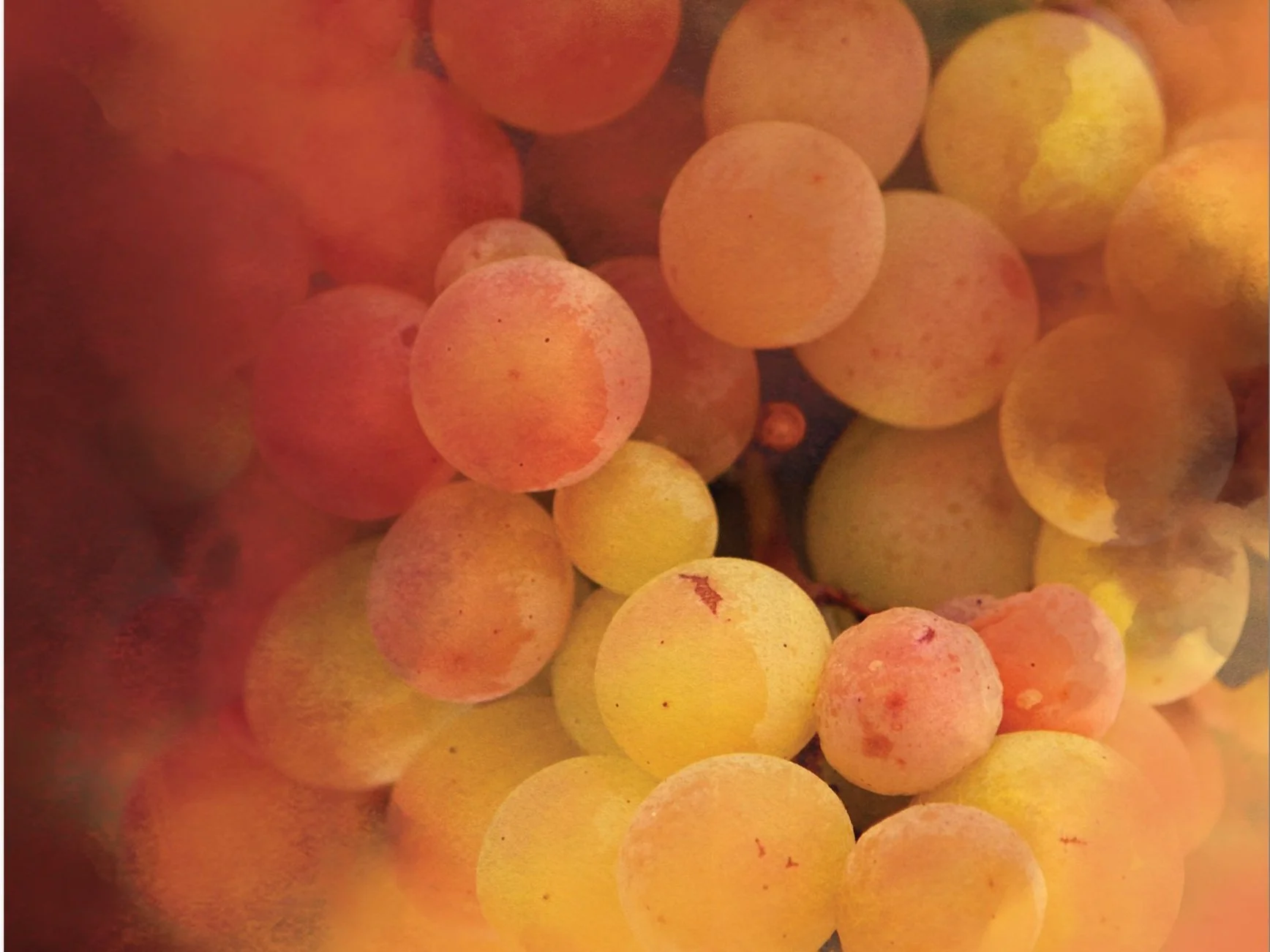
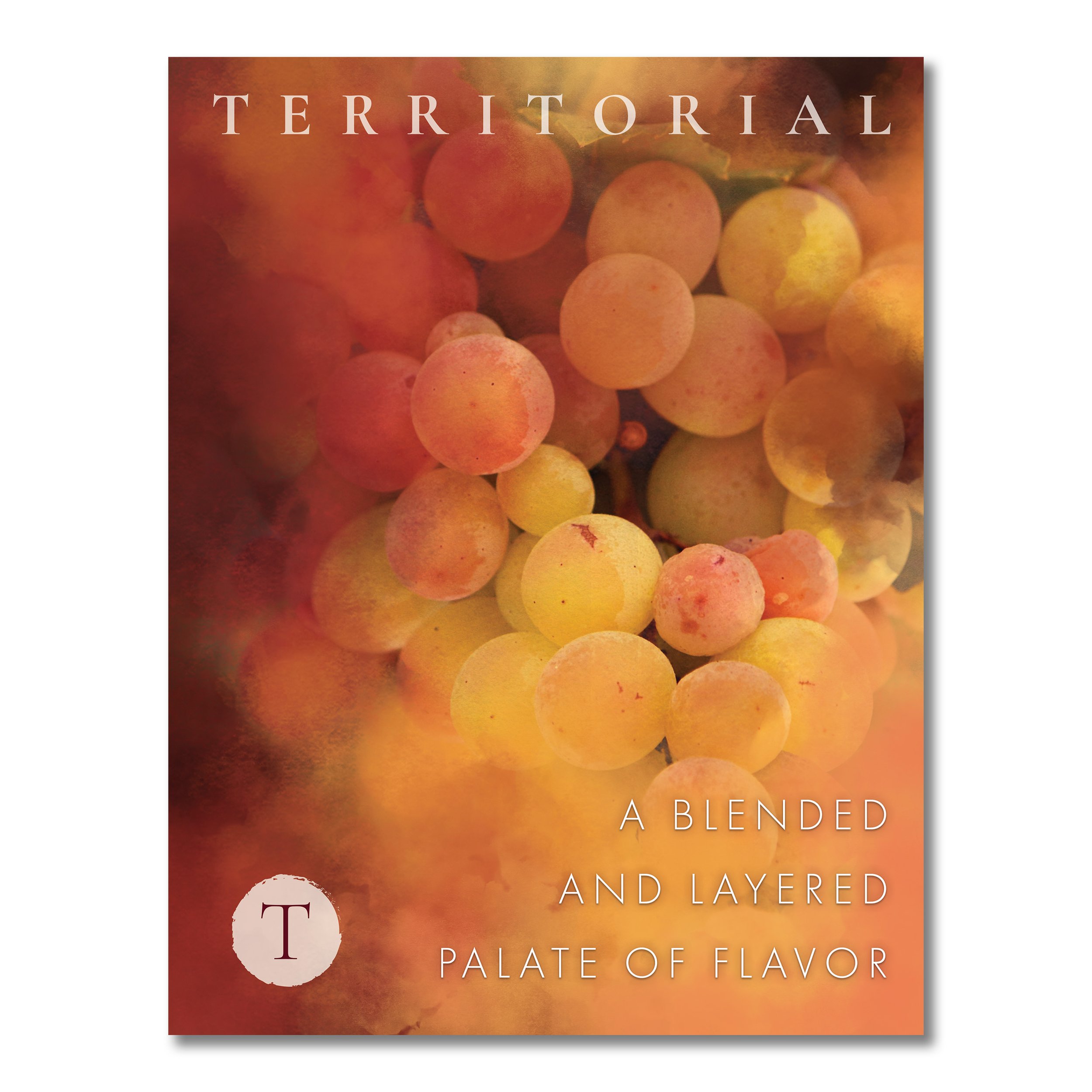
Magazine print advertising designs for Territorial inspired by the company's two contrasting vineyards that meet in harmony to create a blended palate of flavor.


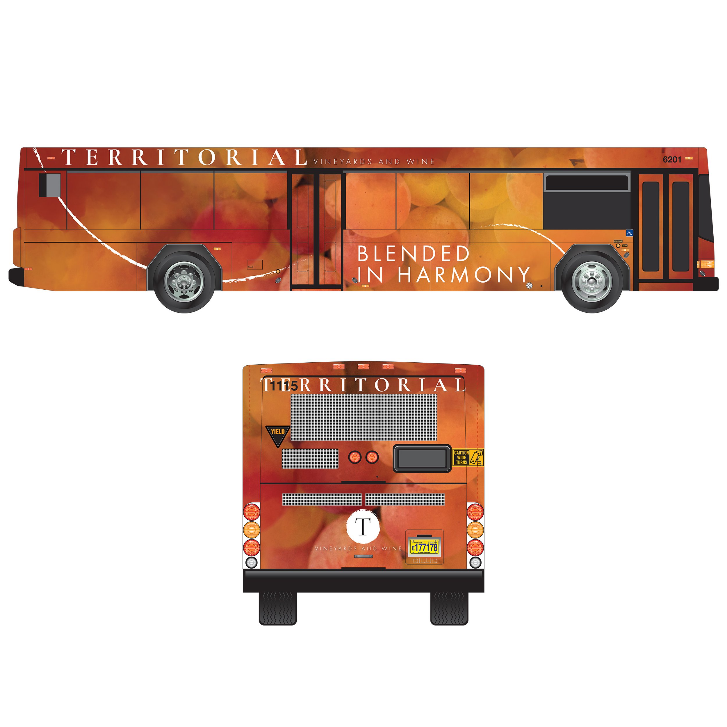
BILLBOARD, TRANSIT


SOCIAL
